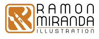
For my english-speakers readers!As István told me, this would be interesting for educational purposes, so here you have it.
Warning ! Today I bring a long post where I explain how I designed my own logo , which was a challenge and also an opportunity to know myself better and see my goals, my projects and what I love and drive my passion.
If you find yourself in a similar situation and you want to have some reference of the proceedings , here I have posted all my creative process for the logo . I hope to help you. I have divided the process into 5 phases to organize myself better.
Phase 1. References
Phase 2. Design on paper
Phase 3. From pencil to Vector
Phase 4. Typography
Phase 5. Test on clothes
Phase 1. References
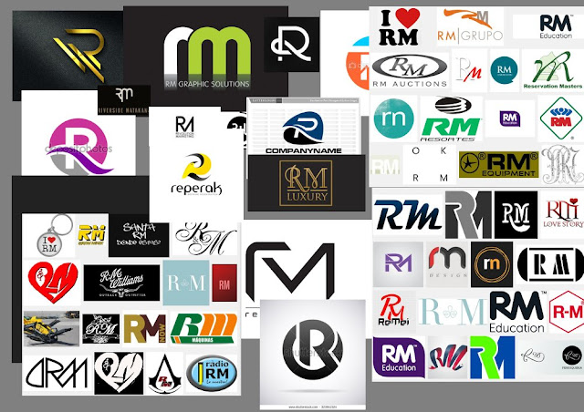
The first step is to see what others have done already . My first search is RM and the letter R. After I searched what other illustrators were using . The problem I see in these logos is they are not fiting my goal of being a printable "brand" in any way and at low cost , (eg one or two colors ) . In my case I think I have a particular "illustration " concept in mind.Then i created a briefing to myself treating me as if it would be for a customer
Phase 2. Design paper
Ok! let’s got to the computer and design ... Nooooo ! wait a minute this is going otherwise. It is good in this first phase sketching on paper and this is what I did. Sketch enough to come up with an idea to develop . It is easier to explore ideas and less expensive for everyone. The computer tends to become very strict , so I prefer dirty graphite . You want to see the phase of sketches ? There it goes.step 01

step 02

But the R and M are still basic in my design . On the other hand in the lower right corner is to look for a square symbol that may accompany my name and activity.
step 03
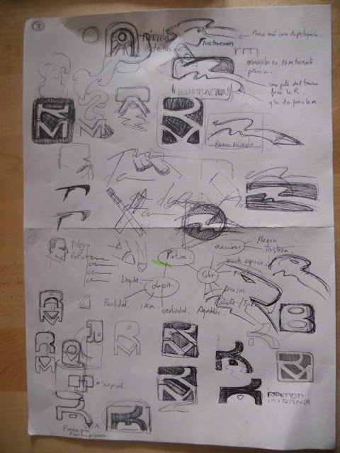
I quit the idea of joined RM and look for something more abstract like an arc with a light in the background. Something very characteristic of my paintings. I keep looking for RM shapes and think on clichés as easels, paint strokes , pens ... I find going to be an intense search . again I return to the RM and a pencil in the negative space between R and M but is not very readable
step 04

step 05

step 06

step 07

step 08

step 09

step 10

I need a font that is not too thick but rounded and that is well spaced .
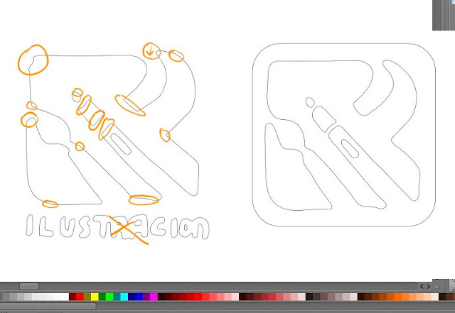
The graphic weight in the 4 quadrants are balanced . I can only correct the negative space of the brush shape
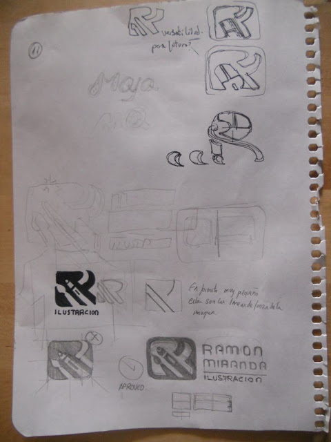
It is done! I have reached the end of the design on paper. I have 3 lines that define the logo . I correct the shape of the brush and add my typographic idea for my name and activity.
Part 2
Let’s go with the second part of this article about creating my logo.
- Phase 3. From pencil to Vector
- Phase 4. Typography
- Phase 5. Test on clothes
Phase 3. From pencil to Vector


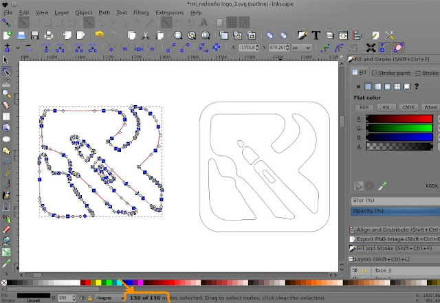
What it does is translate every contour to a vector path. As the design is simple and colorless we make it easy.
I do not recommend leaving the path as it is out of that operation because there is usually an excess of nodes. But it is a good starting point to begin with so i clean the path 130 nodes are too much!
In this case I like the "organic" feeling . But I decide to try pure vector based on a square and draw some nodes. You can see the process from left to right. Using basic primitives and operations of union, subtraction, I can quickly get a result that seems more complex. but does it work? ... hmm.
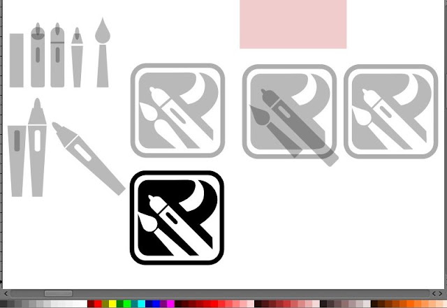
No, it does not work because I lost the organic feeling, it seems very cold and does not convince me. I decide to discard this option and debug the previous design that keeps the organic feel of the sketch.

Later I'll see if I need to remove any other node without losing that feeling of "stain". Bringing the two ideas face to face this is the result

Phase 4. Typography
The choice of typography is as important as the design of the "logo" itself. Thanks to the sketches on paper, I know what I look for in typography. So I go to Dafont.com. I want something clean, modern, and very specific with certain defined strokes. Do I will find it? After seeing 55 pages in Dafont.com under the category of basic / sans serif, I have selected 10 having licenses to use them freely or under acceptable conditions.
After analyzing each stick, pole, x-height, spacing etc ... I have 5 passing to the next stage.

It's hard to leave behind such beautiful fonts but i have clear indication of why i do not choose them. Too much angles or spikes in its design, (peaks in M and R) not rounded sticks, which produces optical kerning spaces that i do not like, too thick, my own taste or intuition ...

At the end the chosen one in the contest "Miss font RM 2016" is ...
The Chata!
Credit typography "la chata" for its creator. http://defharo.com/
Thanks Fernando for such a good job. If you seek sources for your personal or commercial projects, Fernando is a professional.
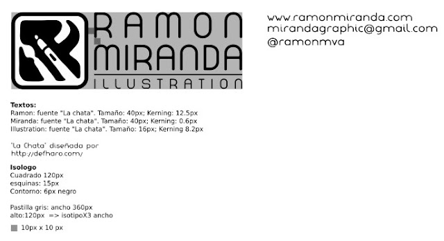
And with that I have set all my logo design. Sizes, sources relationships, kerning ... but what about color?

In the case of color I have not had many problems because I already knew it was going to be a warm tone. I want to introduce you # cc7722ff better known as ocher.
If we add the symbolic meaning,Since the beginning of mankind we have transmitted information through paintings. The pigment of the earth is stable, durable, and it has been with us throughout history and everywhere. From Egypt to the Renaissance and today. That is what this color means for me. illustration.
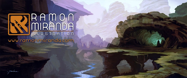
And after having the right color let’s check it out in real surfaces.
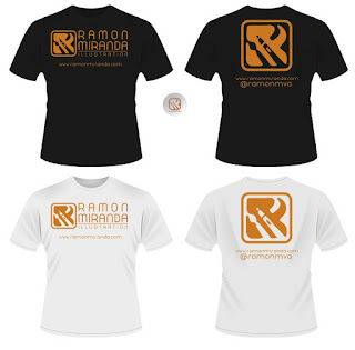
Phase 5. Test on clothes
With the already chosen typography and all defined details,i want to see how it looks on different media such as light backgrounds, dark backgrounds, and background image. This will give me information to know better if my design is versatile or presents a problem that so far has not been seen.The first thing to try is a shirt. White and Black.
The following is trying a background image.
And that's all for today! if you liked the article do not forget to share so more people will see it, perhaps you will take away a headache to someone. Thanks .
Good step by step guide for logo digitizing. A good guide for newbies... to learn and to know why typography is important. Thanks.
ResponderEliminarWow! this is really impressive and I read this article. I think You put a lot of effort to create this article. I appreciate your logo design work.
ResponderEliminarRamon Miranda's logo design is truly inspiring, showcasing a perfect blend of creativity and professionalism. The clean lines and thoughtful color choices reflect a deep understanding of modern design principles. It's evident that every element is carefully crafted to represent the brand's identity effectively. For anyone looking to convert their logos into embroidery, Logo Digitizing by Digitizing Buddy can ensure that the same level of precision and detail is maintained in the final embroidered product.
ResponderEliminar