Mostrando entradas con la etiqueta brushes. Mostrar todas las entradas

3/4/18

A new dawn, alegory . The Making off


Hi all, today I am going to show you my latest painting done in Krita 4.0 while i was collaborating to provide resources like brushes, brushtips, and patterns.
I think Krita deserves a good promotional images (at least finished images) and this was also a good testing canvas for that. My 2 cents ;)
This image reflects the emotional state that makes me feel this new release. So here you have...
"A new dawn, alegory" i hope you like it.

13/2/18

Round 2. Visual Experiment for Krita 4.0 new layout proposal

Round2.

Virtual Deleted (for now) 44 brushes,  88 left.

virtual deleted bruhes.

How i decide what to remove? well i have tried to get the more visual pleasant and useful combination. My focus is what people could expect the first time krita opens. and make the experience as much comfortable as possible. No knowledge of tools or brushes are needed.
So if you like the idea here we go.

This is a document with lot of info, not for begginers even when they can learn some tips here and there, but lot of terminology is present.

You are going to see lot of “IMO”( in my opinion). Of course you can disagree totally or not. I expose my ideas based on my own experience and i hope this help, if you like flames i am not you man ;)
Also you will need this image to follow the numbers.
  • 1 it can be changed by eraser soft. They do basically the same, erase softly. the Airbrush erase don´t use the Airbrush feature. Also imo is not a good idea put an eraser as the first brush in the default pack.If you(begginer) try it in a blank layer you can see nothing is happening and think the software is bad or the tool is not working.
  • 3 The “noise” size controlled by density can’t be modified In big canvas sizes. This could be make the noisy effect invisible or not perceptible.
  • 4 Airbrush pressure is a redundant term. It would be like the tipical Airbrush. Added 2 instead, Airbrush linear i would remove linear.
  • 7 we have a lot of “wetpaint” colorsmudge brushengine based brushes. 
  • 9 Gaussian term is not a common word to describe behavior in brushes. It is slow and Soft curve can do the same and more imo.
  • 12 The Soft thing is not enough for me to be as brush.
  • 14 Added 20 instead. If the tablet has no tilt options, we can use RMB to change angle.
  • 22,26, 27 Added 24 instead.I wish to control the size of bristles and the scale of them. nowadays they are always 1px width wich is nice for low res but is useless for highres images. 6000px wide.
  • 38, 39, 40 i can’t see practical uses. Maybe sketching. Added 37 to have a sample of this brushengine. I would add to the “specials” category
  • 44 added 45 instead in “ink” category. It is only to fill big areas, it could be replaced by 86 or 87. The tip can be changed to be square to be more usable in squared surfaces just changing the brush tip to square.
  • 46 Slow and nowadays we have another Blender Blur wich is soft. If DOF is what we need i would put it in FX or Distort Category
  • 51 There is a newer version for krita4. WIP
  • 55, 56, 57 Added 53, 54 instead in Texture category
  • 60 It can be replaced by 63. The ink stroke
  • 62, 64 Very small imo. Added 63 instead
  • 65 added 68 instead.
  • 69, 70, 71,72 i consider them as basic brushes. 69 or 71 can be replaced for 20. 70 can be replaced by basic brush with opacity by pressure. 72 can be replaced by ink brush just to take notes. 
  • 77 added 78 instead . Is texture controlled by pattern in Basic category
  • 94 Added 93 instead. We can control opacity by the upper menu slider or RMB. it would be great to have opacity by pressure or gradient as original Alchemy software.
  • 97,98,99,100,101,102,103,104,105. added 95, 96 as representation of the Sketchbrushengine. Shows basic features. Too much variation of the same brush engine (11 brushes). The pencil icon is not very intuitive. Size doesn’t control real size but Area to be affected and this is not usual behavior but special behavior in sketch brushengine. This can confuse some users.
  • 115 Useless imo. Only show change on color dynamics.The sorrounder brushes are very different. And the icon is related to dry technique like pastel so this could be confusing. 
  • 117 Added 120 (Blending cat. “Particle” Effect that blends color.)
  • 123 Added 118, 121 instead
  • 129 It is not related with nature neither texture. Random in rotation makes very hard to predict results. And useless imo.


That's all for the Round 2. Could i remove more brushes? could i simplify a bit more but without loosing quality and options for the user? maybe in Round 3 . Sharing and comments are apreciated as always. more feedback means better software

12/2/18

Round 1. Visual Experiment for Krita 4.0 new layout proposal


The Krita team is working hard to release Krita 4.0 on March. We as users try to help in some ways not always coding but creating resources and giving feedback and ideas.So, maybe this post could be interesting for you as krita user. here we go. consider this like a live post, where i am going to publish my ideas on this subject. My ideas to organize the krita brush set a bit more

I have been thinking about how to get the best of what we already have in krita. It sounds a bit crazy but take it as it is. **An experimental place for experimentation.** As we are making new things with brushes maybe is a good time for this kind of thing.
Sometimes is complicated due emotional attachments to the brushes. But for this experiment imagine everything is possible and nothing is solid like a rock

I often find myself searching for the right presets and then I have to search by word or visually. That is not a big issue. It takes me little time but I feel is not the best way to do that.

I have thought what other users might be using, so i take in consideration some facts:
  • What  Videos, tutorials,  screen capture, photos, are showing about layout and preferences
  • There is not a perfect solution. Even when is the best solution people can disagree due they are used to previous solution or personal taste.
  • krita covers a widest range of users. From beginners to pro users.
  • Pro or advanced users often use customized tools
This is my proposal to have the krita set more organized. To do it** I have printed several copies,numbered and wrote brushes name and cut all the brushes separately.
This makes the set more mobile because I can move brushes freely without worring about the names. (Then we have to being able to translate all these changes to the real application. Also this way I have a **overall view** on what we have on the table. After lot of game "moving" the brushes i think in them this way

I go from simple brushes , using only opacity and basic spacing to more complicated "organic" feeling . From simple to complex, order to chaos. 
After a bit more of thinking i ended with this idea as a guideline in each category :
 First we have the "Basic" behavior, then we have a more  Textured Brushtroke, then we have the brushes that are controlled with Pattern, and finally we have  Special Brushengines (Hairy, Hatch...)
(I think this helps also the user to guess where to look for a textured brush for example.)


Let's put a name on them
**Is hard to find good names, even harder ordering them alphabetically, but here we go. Who knows, maybe you will like it.**
 Basic (10 basic brushes to cover a wide range of painting without knowing the program) **covers painting both hard and soft,texture by brush tip and pattern,erasing and basic blend.**
These are my basic for a begginer. If you post in a wheel you get something like this.

Blenders
Draw (pencil and shading)
Erasers
Ink
Modify color (blending modes)
Painting
Paintwet(colorsmudge)
Smudgers (if we don't want to use the blender word and here has more sense because they are wet too.
Texture brush (brushes with more organic feel. Simmulates texture by the brush tip. Low spacing)
Texture rough (textures with big sizes and big spacing. Also controlled by patterns)
Specials(other brushengines) they are almost at the end because they have unusual behavior or special features. Pixelart could be here.
ZYX  tangent normal (3d. as this is different from illustrative painting I would keep them at the end of the set.
Quick brushes(I don't know if we are going to keep this brushes )

I have tried to keep the set organized and i have deleted more than 40 brushes, and i find the set visually easier to understand. 
If you have suggestions or new ideas just share them on the comments. Thanks 

I have a list with all the brushes that i have removed and why. are you interested or do i finish this experiment?

More info about brushes soon. you can take a look into the krita brushes core place here at phabricator. https://phabricator.kde.org/T7424


20/2/16

Muses DVD preset Pack in bundle format for 4.x!


It is time for an update!
Recently some people asked for a bundle format so i have been working on making a bundle. If you like it, let me know..

Download here

Want to see some examples?

28/8/13

Pintura Expresiva en Krita con los Hairy presets


Hola, El set por defecto en Krita es grande, no gigantesco, pero ciertamente grande. Así, pues, podemos perdernos algunas veces si no realizamos una exploración profunda.. Pero esa “exploración” a veces trae consigo gemas a la luz. Veamos que he descubierto ultimamente.


Después de una dura pero productiva prueba, creo que he llegado a un punto estable para estos presets. Son muy rápidos cuando ajustas algunos parámetros y esto los hace muy interesantes.
Estaba confundido con los presets antiguos, porque no les podía dar una función específica así que los cambié. Espero que os gusten los nuevos.
Vi que había 4 cosas que me frenaban de usarlos.
  1. Mala velocidad en general.
  2. Opacidad puesta al máximo sin sensibilidad a la presión. (esto pudiera funcionar si el brush engine tendría mezcla de color como el color-smudge)
  3. Los presets pequeños que tienen buena velocidad son dificiles de usar para crear detalles.
  4. Los nombres. Según leía sus nombres intenté crear una lógica pero es dificil. “limpio” “sucio” son adjetivos muy genéricos y subjetivos.

    Nuevo set propuesto:
    Cambios:
    Cambiar del modo de pintura Wash al modo Buil-up
    Activar la opacidad controlada por la curva de presión.

    Este set es muy util para pintura expresiva, no un estilo hiperrealista en principio. Cubre un ancho rango de las opciones del motor de pinceles Hairy-Brush y por fin es fácil de usar.
    He usado los iconos simplificados por ahora manteniendo el antiguo degradado. Si los presets se acogen bien los completaré con una mejor versión de su icono. Tenemos un monton de ellos en:


Notas:
  • Todos usan antialias. No he visto un impacto negativo significativo en la velocidad y la calidad mejora un poco a un 100% de Zoom.
  • La mayoría usan Bristle options/Mouse Pressure. Este parámetro usa la velocidad de la pincelada para aumentar el tamaño. Lo encuentro interesante porque podemos hacer cosas más detalladas según vamos pintando más despacio.
  • La mayoría usan un poco del parámetro “Shear” (aprox = 0.14) para evitar el efecto “superrecto” en las cerdas del pincel.
  • Algunos de ellos usan “Ascension” con una rampa no muy común. Esta rampa es útil para restringir la cantidad de grados que puedes rotar tu mano antes de que el pincel empiece a rotar. Cubre la rotación de Izquierda y Derecha. Con solo modificar los puntos extremos de la curva hacemos este comportamiento más sensible o menos.

Contenidos

Hay 6 presets que pueden ser claramente identificados. Los he diseñado para ser usados incluso con el ratón y seguir manteniendo la apariencia de la pincelada obtenida con el Stylus. La descripción es para un uso Genérico, pero se pueden utilizar como se quiera. Los describo según aparecen alfabéticamente.

Hairy_Details
Para crear detalles en la imagen. Fácil de usar. Se puede ver cómo cambia el tamaño si se usa una gran velocidad. Combinándolo con diferentes niveles de presión y velocidad, puede hacer muchas pinceladas diferentes.

Hairy_Large
Para crear Fondos y cubrir áreas grandes. Usa “ascension” para hacerlo más versatil.

Hairy_Special_Blender
No es un Difumino común porque “pinta” solo con el color que está debajo del punto de contacto del stylus. Para esparcir ese color alrededor usando la opacidad contralada por la presión. (frase rara, lo se, pero se entiende mejor si se prueba. Confía en mi)
Usa “ascension” para poder hacer efectos más aleatorios girando el lápiz según cambiamos el ángulo de la muñeca, creando un efecto grano muy interesante o patrones, dependiendo de la dirección en la que hagamos la pincelada.
Si se aplica una presión leve, se consigue una buena mezcla con un agradable efecto de grano suave.

Hairy_Squared
Este es un pincel de tipo cuadrado. Puede usarse como pincel genérico para un tamaño de áreas mediano. No usa demasiados parámetros para hacerlo más controlable con una buena predicción en el resultado final como un pincel clásico.

Hairy_Tapered
Crea una pincelada de efecto cónico o afilada. Los mejores resultados se producen cuando se combinan presión y un movimiento en rápido en el gesto de la pincelada que queremos. Movimientos lentos hacen que se pueda usar con detalles. Como “contornos.” Una presión baja y un movimiento rápido es útil para cubrir areas de mediano tamaño con una capa de pintura de veladura con pinceladas semitransparentes.

Hairy_Texture
Crea un efecto texturizado como de esponja. El usuario puede controlar este efecto con bristle options/random offset. Cuidado con este valor. Valores muy altos pueden hacer caer la velocidad de la pincelada, aunque es divertido explorarlo. Depende tambien de como sea de potente la PC.
También se puede modificar el parámetro “ densidad” en la punta de pincel para acer el efecto “tela de araña” más o menos visible. La densidad controla la cantidad de las partes visibles de un pincel. También se puede variar la barra deslizante “density” en bristle options/density


Descarga

El pack de presets se puede descargar aquí. http://goo.gl/j4vpft
debaría ser compatible con 2.7 y 2.8dev
Licencia: El pack de presets y los iconos estan liberados bajo la WTFPL 2.0  ( compatible Public Domain and CC-0 ). 


Instalación

Descomprime el Zip previamente descargado y pega los archivos en tu directorio de preferencias de Krita. Bajo Mint 14 KDE está en  /home//.kde/share/apps/krita/paintoppresets


Expressive Painting with Hairy presets in Krita


Hi!
Ramon Miranda here! Let's talk about Krita brush sets. The default set is big, not huge... But certainly big enough so you can get lost easily if you don't spend a lot of time investigating. But if you dig deep enough, and explore the huge number of options, you'll find some real gems. So lets see what i have discovered about one type of brushes: the hairy brushes.


The Default Hairy Brush Set:

After a some thorough and productive testing time, I got to a point where I managed to get a predictable and stable performance out of the hairy brushes. the hairy brushes can be very fast when you tweak some values, and that makes them more interesting.
The current set is a very good starting point but I felt I could improve on it. Read on for what I did – and a sneak preview of the Muses Painting with Krita DVD (which is getting very close now!)

The Muses Hairy Brush Set:

For starters:
Let's change the painting mode from Wash to Build-up and link the opacity to the pressure curve sensor. Now we've got something that quite useful for expressive painting, but not for a realistic style.
Let's also improve the icons we use a bit. Check out http://community.kde.org/Krita/Brushes_Preset_Preview for ongoing to work to coordinate the icons for Krita preset packs!
Next: advanced options:
  • Anti-aliasing: I haven´t seen a significant negative impact on performance and the quality improves a bit at 100% zoom level, so I've turned this on for all brushes.
  • Most of them use Bristle options/Mouse Pressure. This parameter uses the speed of the brushtroke to increase the size. I found it interesting, because we can make more detailed things as we paint slower.
  • All of them use a bit of Shear parameter to avoid the “superstraight” effect on bristles
  • Also some of these new presets use the Ascension with a not common ramp. This ramp is useful to constrain the amount of degrees you can rotate your hand before the brush start to rotate and covers the Left and Right rotation. You only have to modify the corners points to make this behavior more sensitive.


Contents of the Hairy Brush Pack

There are 6 presets that can be clearly identified. I designed them to be usable not just with a tablet, but also with a mouse – and still keep most of the appearance of a brushtroke. The description is for generic use, don't limit yourself!

Hairy_Details: An easy to use detailing brush. You can see how the size changes if you go faster. Combined with different pressures and speed you get a lot of variety in your brushtrokes. Great to create edges and little details with slow speed.

Hairy_Large: To make backgrounds and cover large areas. It uses “ascension” to make it more versatile.

Hairy_Special_Blender: Not a common blender! It “paints”, but only with the color that is below the direct contact point of the stylus: it smears that color around using the opacity controlled by pressure. Sounds weird? Just give it a try!
The hairy special blender uses the “ascension” feature to make it more random and versatile. As you change the wrist angle we change the “grainy” direction so we can create “rare” patterns if we want. You'll need a tablet that support tilt to experience the feature, of course.
If you apply low pressure, you'll achieve a really nice kind of blending with a nice, soft grainy effect.

Hairy_Squared: This is a Squared Type brush. It can be use as a generic brush for mid size areas. And with not too much effects on parameters to make it controllable with a good predictable result like a classical bristle brush.

Hairy_Tapered: Creates a tapered brushtroke. You'll get the best results if you combine pressure with a fast, “gestured” stroke. Moving slowly makes it usable for details, like edges. Low pressure but fast movement is useful to cover mid size areas like a glazing with semi translucent brushtrokes.

Hairy_Texture: Creates a textured look – a bit like a sponge. The user can control this effect with bristle options/random offset. Be careful with this value. Bigger values can decrease performance – but still fun to experiment with.
You can modify the Density parameter on the Brush nib to make the “spider-web” look less visible. The “density” controls the amount of the brush visible parts. Another tweak: you can vary the “density” bar on the bristle options/density

How to install:

Download

The brushkit ZIP can be downloaded here.
The brush set is compatible with Krita 2.7 and the current 2.8 development branch.
License :  the brushkit itself and thumbnails is released under the WTFPL 2.0  ( compatible Public Domain and CC-0 ).

Install

Unzip the downloaded zip , and paste the files into your Krita user preference directory. On Linux, the Krita preferences are located here :  /home//.kde/share/apps/krita/paintoppresets


1/9/12

NEW set for KRITA software (2.9 or later)


EDIT:09/09/17

As i have noticed, there are lot of visits to this page! :) Well, honestly These are old presets that i created for Krita and i think maybe people is missing my newest ones. So if you are interested in my Presets packs, here you can find much better designed pack. Enjoy it!

DOWNLOAD: Krita Preset Pack by RamonMiranda

And this is the post where i explain what does it have the new bundle.
http://www.ramonmiranda.com/2016/02/muses-dvd-preset-pack-in-bundle-format.html

 BTW i am thinking about to make new presets again so stay tuned. ;) And thanks to Jacob for letting me know that the link was broken.
28/9/11

Gimp 2.8 GPS preview . Parte 1

Muy buenas!
Con la llegada de gimp 2.8 vendrán cosas muy interesantes para el mundo de la ilustración. Como adelanto, una imagen con la que he ido probando las nuevas dinámicas de Gimp en su versión de desarrollo 2.7.3 bajo Ubuntu. Os puedo decir que son geniales y que multiplican por mucho la cantidad de opciones que tenemos crear pinceles. También he notado una mejora en la forma en como Gimp detecta la presión.


Una de las cosas mas interesantes para los que usan gimp en Ilustración será el "selector de presets" como se puede ver en la imagen siguiente.(Evidentemente no se trabaja así con todas los paneles desplegados :D . Pero cuando estoy desarrollando las herramientas es muy útil tener todo a un golpe de vista.)


Esta es la parte donde se controlan las dinámicas. Como se ve, se ha pasado de un "slider" a un complejo sistema de curvas, con lo que será mucho más facil poner las cosas como queremos. A simple vista impresiona pero es más sencillo de lo que aparenta y el control que nos da merece la pena los minutos extra de investigación.


Y eso es todo por ahora. Espero vuestros comentarios y happy Painting!

31/3/11

MyPaint. Tutorial de Creación de Pinceles


Por fin lo he terminado!
Muchas veces he recibido correos felicitándome por los pinceles de MyPaint y eso la verdad que anima mucho, pero a la vez me decían que se ven sobresaturados al ver el editor de pinceles.
La verdad es que impresiona ver un panel tan grande lleno de números, nombres raros, y sliders con diferentes valores.
¿Y qué pasa si quiero adaptar los pinceles a mi propio estilo de trabajo o quiero hacer los míos propios?

13/12/10

Ramon Set explained! the easy way to paint on MyPaint


Hi all! 
MyPaint 0.9 is here and that is a very good new for everybody who loves to paint.I have developed
Today i want to share with you a brief document that will help new MyPaint users to get a simple idea of what they have in their hands when they are painting with Ramon set in MyPaint. You can download from the "MyPaintAtelier project, which holds all my documents or experiments that helps to understand MyPAint better.
So if you are a new user or midlevel user this document is for you totally free. you can print, copy ,post on your blog, show in a presentation.. whatever.

if you are more interested on MyPaint stuff, you can see the "MyPaint" tag on the blog. or go directly here to learn more about brushes.Brushes Explanation

You can also download more brushes here: BrushPacks for Mypaint

3/9/10

Bailarina Andaluza.

Hola ,
hay veces que te pones a probar un software en este caso, CS5 y te salen cosas curiosas, expresivas y desenfadadas. Me gustan este tipo de trabajos rápidos que no llevan mas de 20 min. Pero que te llenan casi como un cuadro de semanas de trabajo. Es este caso fui viendo una bailarina según hacia los trazos, así que fui por ello. No soy un experto es sevillanas ni flamenco pero bueno ,siempre me ha gustado la energía que desprenden. Y el colorido ,lleno de rojos amarillos y contrastes fuertes.

En la parte técnica del experimento resaltar que al menos en mi equipo, pintar con los nuevos pinceles de CS5 es un tanto estresante por la lentitud en resoluciones de A4 a 300dpi. Las funciones 3d de los pinceles son muy potentes pero creo que aun les faltan cosas importantes. De todas formas es un cambio importante para CS pues desde hace mucho otros softwares ya podian mezclar color directamente en la pincelada , vease Painter 6, Opencanvas 0.98b, Y actualmente hay Softwares mas ágiles para estas tareas. Si piensas comprar Photoshop CS5 por estas nuevas features, investigalo bien primero, no vaya a ser que te gastes 2000 euros y luego no puedas pintar a gusto o le exijas mas a las herramientas de lo que realmente dan. Es un consejo ,si es que puedo dar alguno.
 

31/8/10

Pruebas de oleo Digital . ...Continuación

Buenas,

Hacia tiempo que no publicaba nada. La verdad , parece una eternidad .He estado centrado en una serie de temas personales que nada tienen que ver con el mundo del arte. Y como este no es un blog de prensa rosa sino de exploración de nuevos softwares,recursos ,tutoriales y experimentos, aquí está lo ultimo que he andado haciendo. Las imágenes son 2 experimentos de texturas creadas directamente en Photoshop buscando la expresividad propia del oleo.

No le deis muchas vueltas ,estáis viendo bien. Son manchas ,expresión en estado puro. Lo que se me venia a la cabeza sin pensarlo ni depurarlo. Como cuando pinta un niño al que le dejan un lápiz sin la presión de tener que realizar ninguna obra terminada, sin la sensación de que hay unos ojos escrutadores que te juzgaran por la calidad de tal o cual linea o color. Manchas... difusas y desorganizadas, oscuras y brillantes. Manchas... como la vida misma en ocasiones.Haz click en las imágenes y las verás en un tamaño más grande.


UPDATED :-----------------------------------------

1/6/10

Tutorial: Pintando un ojo en Gimp

Hola a todos,  En esta ocasion he preparado un tutorial para aquellos que quieren aprender a pintar de manera sencilla y con muchas explicaciones. Es un tutorial en formato PDF por si quereis imprimirlo o tenerlo disponible sin necesidad de estar conectados.
El tutorial consta de 5 partes claramente diferenciadas.Las herramientas utilizadas son Gimp y GPS pero puede utilizarse cualquier programa, pues básicamente se tratan los conceptos de luz, color y contrastes, No como reproducirlo en un software en particular.Asi pues, aqui teneis el primer tutorial paso a paso. "Pintando un ojo en Gimp". Si teneis sugerencias o criticas hacédmelo saber o por el blog o por el mail, como más os guste.
  

25/5/10

MyPaint Videotutorials "Understanding Brushes"


Here we go! Grin Grin
This is a serie of tutorials to show people how my brushes work on mypaint (and also lot of different things mypaint related.). It will cover since the basics to advanced stuff, while i explain the uses of different brushes. Hope you like it.  Wink . there i will explain thinks like noise tracking, jitter, inverted pressure , fine speed ...and more

Part 1:
http://www.youtube.com/user/TheShockito#p/u/4/pUrs02n7Lvw


Part 2:
http://www.youtube.com/user/TheShockito#p/u/u-all/2/BXlBk48zB0c


Part 3:
http://www.youtube.com/user/TheShockito#p/u/1/1xcGqSNMo2k


Part 4:
http://www.youtube.com/user/TheShockito#p/u/0/OG4npvV5_Jk


Part 5:
http://www.youtube.com/watch?v=Ulyh65sjVh4


Part 6:
http://www.youtube.com/watch?v=t5442iDhJC8&feature=related


Part 7:
http://www.youtube.com/watch?v=MkgXpAEObEo&feature=related


Part 8:
http://www.youtube.com/watch?v=57XjGizusMI&feature=related


End of the course for now. i hope this will help you. byeee
Take care

30/4/10

Photoshop Artistic Oils Brushkit. VIDEOS

Hi all, now...the videos are just here!! Enjoy them.

You can see the high-res version on Youtube. HD =1270 with more detail. nice uh?
Part 1

Part 2

28/4/10

Photoshop Artistic Oils Brushkit.


Hola a todos, este es un post realmente especial.


Motivación
Desde que comencé mi formación en el mundo digital, siempre he tratado de emular las técnicas y comportamientos del arte clásico. No eran pocas las veces en las que hablaba con el Sr.Unzalu (mi profesor de arte )sobre las posibilidades futuras de la pintura digital. Mucho tiempo ha pasado desde entonces y creo que en ese sentido hoy cierro un ciclo muuyy largo de busqueda experimentacion y por qué no decirlo, frustación. Aqui os presento mi set personal para pintar al óleo en Photoshop CS3.


Que lo disfruteis.Como siempre si os ha gustado la informacion y la veis util podeis suscribiros a mi canal de youtube donde hay más informacion sobre estos temas y muchos otros..saludos!


And here you can see 2 videotutorials to show you how to use them. Enjoy it! Share!


1/4/10

Gimp Sketching Tools :Exercises 001


"Un martillo no sirve para nada, si nadie lo coje y lo utiliza".de igual forma la verdadera utilidad de mis herramientas se demuestran mediante la accion. He hablado en alguna ocasión de la posibilidad de trabajar con unas buenas herramientas de abocetado o sketching dentro de Gimp mediante (Gimp Paint Studio) . Pues esto que enseño a continuacion es una muestra de lo que se puede hacer con estas herramientas. Pero no me cansaré de decirlo,este es el uso que les he dado yo. Cada uno puede explorar nuevas ideas y buscar nuevas combinaciones.
Y si bien los resultados a mi parecer son interesantes en varios aspectos, lo mejor de estas herramientas se produce cuando las usas “tu” personalmente. El “feeling” que te da tener la sensacion de estar trabajando con un lapiz real (salvando las distancias claro) pero eso no lo puedo explicar, cuando se prueba, se entiende lo que digo.


Para usar estos presets, puede ser util conocer que fueron diseñados para trabajar en alta resolucion, por eso si nuestra imagen es de 800x600, los resultados no seran los mismos pues se pierde el efecto de grano de papel simulado aleatorio.. Un buen tamaño para hacer “sketching” puede ser un Din A6 o DinA5. En tamaños superiores, imagino que dependera bastante del equipo que utilicemos. De todas formas a los tamaños de pincel predefinidos en el preset, no deberiamos tener problemas si nuestro trazo no es exageradamente rapido. Si no, se producira un efecto de “retraso” un poco molesto.
Por eso no conviene escalar demasiado el tamaño a mas de 1.3 . Se empieza a ver el efecto de grano de papel de pincel “pixelado” ok?


Buenas conbinaciones para trabajar con presets de “Sketching”

De las pruebas que voy realizando voy sacando mis conclusiones personales que comparto con vosotros.

Los estudios que os he puesto tienen en comun las herramientas utilizadas para crearlos.

2B Pencil Grain2
Ideal para trazar las primeras lineas del boceto y dibujar lo los contornos de nuestro tema. Tambien es util para sombrear zonas pequeñas que queramos remarcar como por ejemplo el interior de un ojo o una ceja. Con superficies muy grandes no produce un buen sombreado uniforme.

2B Shade Grain 2
A baja opacidad se comporta muy bien, produciendo un sombreado uniforme pero respetando el grano mientras no se escale demasiado el tamaño. El tamaño de 2B Pencil Grain y 2B Shade Grain deben ser el mismo para que el efecto sea optimo.

Graphite pencil
Lo utilizo para dar pequeños toques de contraste o redibujar zonas que por el sombreado queden demasiado fundidas. Su punta uniforme y redonda lo hace ideal para perfilar contornos con una linea limpia


Esto es todo por hoy. Según vaya sacando más ideas os iré avisando.


16/3/10

Lanzamiento de Gimp Paint Studio 1.4


Hola a todos! Es para mi un placer poder anunciar el nuevo lanzamiento de la versión 1.4 de Gimp Paint Studio. Si el 1.3 se centró en recrear presets del tipo “sketching” para hacer bocetos rápidos o dibujos mas detallados, (Gimp Paint Studio)1.4 se centra en efectos especiales, los cuales nos harán la vida mucho fácil a la hora de pintar cosas complejas como por ejemplo efectos de fuego, vegetación, etc. Es una versión donde los conceptos experimentales son mas evidentes. De ahí que los últimos presets sean muy innovadores abriendo un campo hacia lo nuevas técnicas de creación de presets.

La mascota que sera representativa de GPS es el Dragón mecánico, de ahí el nuevo logo e imagen de GPS 1.4

EL cambio de tipografía se debe a una sugerencia de Mozart Couto. La fuente Stetinga creo que queda bastante bien, le da  más cuerpo y permite ademas algunas variantes de diseño tipográfico.

Los presets de fuego son un reciente descubrimiento por mi parte.
Los presets de vegetación controlados ahora por rampas de degradado tambien han mejorado en general. .. como cualquier avance en la civilización, viene del deseo y la necesidad de simplificar el trabajo repetitivo.

A lo largo de mi vida me voy involucrando en diferentes proyectos según mi interés o necesidad. La tecnología  avanza cada vez mas rápido y hay muchos campos diferentes que me gustaría explorar. Así que hasta por lo menos en Diciembre del 2010 no esperéis otra versión de GPS oficial.

Con esta versión doy por finalizado el ciclo de GPS en gimp 2.6. Creo haber creado uno de los sets de pintura mas completos que se puedan encontrar libremente por la red. Y espero que muchos de vosotros os podrais beneficiar de todo este material. Ahora os dejo con unas imágenes que dan una muestra de la nueva imagen de GPS. Que lo disfrutéis!


ENGLISH READERS:

Hello everyone! It is a pleasure for me to announce the new release of Gimp Paint Studio. If the 1.3 is focused on create presets such as "sketching" to make quick sketches or more detailed drawings (Gimp Paint Studio) 1.4 focuses on special effects, which we will make life much easier when painting complex things like eg fire effects, vegetation, etc.. It is an experimental version where concepts are more evident. Hence, the presets are very innovative past by opening a new field into the techniques for creating presets. 
The pet representative of GPS is the mechanical dragon, hence the new logo and image of GPS 1.4 The change of typography is due to a suggestion by Mozart Couto. The source Stetinga is pretty good I think, gives more body and it also allows some variations of typographic design. 
The presets of fire is a recent discovery for my own.The presets now controlled by vegetation gradient ramps have also generally improved. .. any progress in civilization, comes from the desire and the need to simplify the repetitive work. 
Throughout my life I'm getting involved in various projects based in my interest or needs. Technology moves faster and faster and there are many different fields that I wish to explore. So until at least December 2010 did not expect another version of the official GPS. With this version I completed the cycle by GPS in gimp 2.6. I have created one of the most complete sets of paintings that can be found freely on the network. And I hope many of you will benefit from all this stuff. Now I leave you with images that offer a window into the new image of GPS. so... enjoy it! 


23/11/09

Arms anatomic studies .Timelapse in MyPaint


Hola a todos

Este domingo quiero empezar el post, dedicandoselo a Jose Roses aka Frankitu, un colega de Barcelona, el cual hace unos dias me regaló unos libros que en un principio pueden parecer simples pero una vez empiezas a investigarlos son muy interesantes. Así que este video es para tí, Jose.

Los libros son acerca de anatomía. Doy las referencias por si los quereis buscar:


Constructive anatomy de George B.Bridgman

The human machine de George B.Bridgman

Drawing the Drapped figure de George B.Bridgman


los tres libros son de la editorial Dover Publications, INC.


Arms anatomic studies from Ramon Miranda on Vimeo.


En este video se puede ver como desde una hoja en blanco podemos hacer una serie de estudios rápidos anatómicos, algo muy recomendable para hacer todos los días. He utilizado solo la herramienta “sketch 1” y en algún momento el “Eraser hard” y “Eraser soft”


Espero que os guste. Sigo probando mis propias herramientas asi que no dudeis de comentar vuestras sugerencias o criticas constructivas.. Saludos


21/11/09

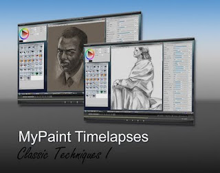
MyPaint Timelapses


Hola a todos,
Desde que empece en el mundo de la imagen digital, siempre he querido reproducir la sensación que tenía cuando practicaba las técnicas clásicas. Al comienzo de esta era digital, los programas de pintura no cubrían muy bien ese aspecto. Pero hoy por hoy tenemos en nuestras manos poderosas herramientas que pueden hacer que hasta los mas reacios a manejar una tableta gráfica, pierdan ese miedo inicial a lo desconocido.

Programas como Corel Painter 6, ( que fue con el que comencé a ver que realmente se podía imitar el medio natural) despertaron en mí el deseo de aplicar mis conocimientos de pintura al medio digital.(desde aquí un beso a mis padres que me pagaron esos 8 años de academia ,con gran esfuerzo; sois los mejores.)

Ha pasado mas de una década y y hemos avanzado mucho. La oferta es abrumadora . SAI, OpenCanvas, Artweaver, Painter , Gimp painter y desde hace poco MyPaint, el cual descubrí gracias a Griatch del foro Gimptalk.. http://www.gimptalk.com/

Todos estos programas tienen algo en común. Pueden mezclar el color directamente en la pantalla. Dicho de otro modo una pincelada sobre otra dará la sensación de que el color se tiende a mezclar. Es lo que conocemos como “Blending”.
Y que mejor modo de empezar a dar a conocer este nuevo software que unos videos donde se ve como pintar algunos temas clásicos con medios digitales y el pack de Brushes diseñado por mi para Mypaint.
Mas abajo podéis encontrar información al respecto.
saludos
DOWNLOAD
Hope you enjoyed looking and Come back later for new stuff. Also you can check this: