1/10/18

Digital Atelier Streaming Youtube


Edit: the link of the streaming :https://www.youtube.com/watch?v=vYHZ5kPZ4DU

Hi all!,
Next friday i will be making my first streaming in Youtube (it will be in english.) There we will see what the Digital Atelier New bundle pack can give to your art in Krita.
So if you like brushes, patterns and these kind of things this is going to be really interesting for you. 
Share with your friends because this Friday 20:00 CEST you have a date with me and krita. 

At the end of the streaming i have surprises and goodies. Stay with me and enjoy it! We can have a lot of fun.


25/9/18

Sunset garden


"El otoño está ya aquí. Con sonido de verano, pero ya la luz va siendo menos. El verano se aleja como una figura distante a la que no podemos tocar. ¿Volveremos a vernos dentro de un tiempo? ¿Hasta la próxima vez quizás? Los últimos rayos de sol adornan tu figura y yo te miro esperando volverte a ver aquí donde las rosas no son rojas sino amarillas, donde las sombras crean recovecos y se puede charlar mejor"

Así de romanticón despido el verano 2018 con una imagen estilo impresionista. El "jardín de la puesta de sol" con la figura de un típico pintor bohemio y a su vez protagonista de una obra impresionista como se presentaban aquellas obras.

Hecho con Krita en una tarde, había reservado esta imagen para un momento especial y este lo es. Veremos que nos depara el Otoño.

3/4/18

A new dawn, alegory . The Making off


Hi all, today I am going to show you my latest painting done in Krita 4.0 while i was collaborating to provide resources like brushes, brushtips, and patterns.
I think Krita deserves a good promotional images (at least finished images) and this was also a good testing canvas for that. My 2 cents ;)
This image reflects the emotional state that makes me feel this new release. So here you have...
"A new dawn, alegory" i hope you like it.

22/3/18

Krita 4.0 ya está aquí


"Un nuevo amanecer, una nueva versión de Krita que cambia muchas cosas como la luz cuando va iluminando poco a poco lo que la rodea." Alegoría.

Hola, muy buenas. ¿Será la primavera? ¿será mi espiritu ñoño haciendo de las suyas? Pues no!
Es que hoy estamos de enhorabuena. Ya ha salido la nueva versión de Krita, la 4.0 donde vamos a poder encontrar muchas novedades. Y si no conoces este programa pues te estás perdiendo una muy buena herramienta que además es completamente gratuita gracias a ser software libre.

Durante la fase de desarrollo he podido colaborar aportando ideas, pinceles, y patrones para usar como texturas. En un post futuro puede que hable de la experiencia en general. Cómo lo he vivido a nivel personal, pero hoy me voy a centrar en Krita.

Lo primero de todo, dar las gracias por ese duro trabajo que hacen los desarrolladores. Y no pienses que Krita es sólo pinceles a nivel de código, es mucho más, y encima multiplataforma. Imagínate todo ese trabajo de depuración de código.

Pero ¿qué es lo que me ha gustado a mí personalmente? Como sabes, si me sigues en el blog o redes, soy un fanático de los pinceles y herramientas digitales. Así que allá voy.
  • Un Nuevo set mejor organizado y más versátil. Pero lo bueno es que se mantiene el set antiguo con lo cual si estabas muy acostumbrado a los pinceles de krita 3 pues no hay problema.
  • El set principal tiene su propia etiqueta así que se puede aislar.
  • Krita ahora soporta el multithread para las pinceladas, con lo cual deberiamos notar una mejora en el rendimiento de krita. Y eso siempre es bueno ¿no? con Shift+ L o desde el menú View/Instant preview mode.
  • Previsualización del trazo en el editor de pinceles. Eso hace más fácil la creación de pinceles. 
  • Krita te ayuda con un nuevo asistente al salvar un nuevo pincel donde puedes añadir imágenes prediseñadas e incluso cambiar cosas como el color de algunas partes del icono.
  • Masked brushes o dual brush como se llama en Photoshop. Permite a los pinceles tener una doble punta que le da más realismo. Fíjate como tenemos un trazo duro en el contorno pero hay utilizamos una doble punta que usa lineas para simular ese efecto útil para fondos o suciedad.
  • El tamaño máximo del pincel puede sobrepasar los 1000px. Pero ojo esto requiere potencia.
  • Curvas prediseñadas para no andar continuamente moviendo puntos en las curvas o simplemente para hacer pruebas.
  • Ahora se puede cambiar el tamaño de los iconos de pinceles más fácilmente con un slider.(Yo sigo usando el Ctrl+Rueda de ratón arriba o abajo.)
A parte de todo esto, muchas mejoras se producen bajo el capó o en funcionalidades no tan usadas. Algo muy bueno va a ser el uso de Python scripts. Y si no preguntádselo a Blender y todo su ecosistema de plugins. De momento hoy mismo ya he visto que alguien está haciendo un plugin para publicar en Mastodon a través de Krita. Pruébalo bajo tu responsabilidad que esto no es de los desarrolladores, que conste. https://github.com/spaceottercode/kritatoot

También si te interesan los videojuegos que seguro que sí ;)

  • Pixel grid si lo que haces se relaciona con el pixelart
  • Normal map si estás más orientado a cosas realistas.
Y luego cosillas que tengo pendiente de probar. 

  • Colorize mask tool para amantes del comic que necesitan dar un color plano a sus imágenes de manera más rápida.
Estabilidad
Personalmente no he tenido, si recuerdo bien, ningún cuelgue mientras pintaba. He notado un buen comportamiento con imágenes de 6000px de ancho, como la que encabeza este post. También tengo que decir que ahora uso tanto Windows 10 como Linux con kde neón o sea que es una gozada poder tener Krita en los dos sistemas.  
Al final del artículo te dejo 2 enlaces. 1º A la noticia oficial de lanzamiento donde puedes ver mucha más info y 2º un enlace las release notes o en spanish las "cosillas guenas que han metido en la saca"

Ahora la última palabra la tienes tú. Si te gusta y lo ves útil para tu trabajo pues dale duro y exprime Krita. Seguro que me dejo algunas cosas por enseñar :D. Y tú? ¿Para que vas a utilizar Krita 4.0? ¿Qué es lo que más te ha gustado de esta nueva versión?

13/2/18

Round 2. Visual Experiment for Krita 4.0 new layout proposal

Round2.

Virtual Deleted (for now) 44 brushes,  88 left.

virtual deleted bruhes.

How i decide what to remove? well i have tried to get the more visual pleasant and useful combination. My focus is what people could expect the first time krita opens. and make the experience as much comfortable as possible. No knowledge of tools or brushes are needed.
So if you like the idea here we go.

This is a document with lot of info, not for begginers even when they can learn some tips here and there, but lot of terminology is present.

You are going to see lot of “IMO”( in my opinion). Of course you can disagree totally or not. I expose my ideas based on my own experience and i hope this help, if you like flames i am not you man ;)
Also you will need this image to follow the numbers.
  • 1 it can be changed by eraser soft. They do basically the same, erase softly. the Airbrush erase don´t use the Airbrush feature. Also imo is not a good idea put an eraser as the first brush in the default pack.If you(begginer) try it in a blank layer you can see nothing is happening and think the software is bad or the tool is not working.
  • 3 The “noise” size controlled by density can’t be modified In big canvas sizes. This could be make the noisy effect invisible or not perceptible.
  • 4 Airbrush pressure is a redundant term. It would be like the tipical Airbrush. Added 2 instead, Airbrush linear i would remove linear.
  • 7 we have a lot of “wetpaint” colorsmudge brushengine based brushes. 
  • 9 Gaussian term is not a common word to describe behavior in brushes. It is slow and Soft curve can do the same and more imo.
  • 12 The Soft thing is not enough for me to be as brush.
  • 14 Added 20 instead. If the tablet has no tilt options, we can use RMB to change angle.
  • 22,26, 27 Added 24 instead.I wish to control the size of bristles and the scale of them. nowadays they are always 1px width wich is nice for low res but is useless for highres images. 6000px wide.
  • 38, 39, 40 i can’t see practical uses. Maybe sketching. Added 37 to have a sample of this brushengine. I would add to the “specials” category
  • 44 added 45 instead in “ink” category. It is only to fill big areas, it could be replaced by 86 or 87. The tip can be changed to be square to be more usable in squared surfaces just changing the brush tip to square.
  • 46 Slow and nowadays we have another Blender Blur wich is soft. If DOF is what we need i would put it in FX or Distort Category
  • 51 There is a newer version for krita4. WIP
  • 55, 56, 57 Added 53, 54 instead in Texture category
  • 60 It can be replaced by 63. The ink stroke
  • 62, 64 Very small imo. Added 63 instead
  • 65 added 68 instead.
  • 69, 70, 71,72 i consider them as basic brushes. 69 or 71 can be replaced for 20. 70 can be replaced by basic brush with opacity by pressure. 72 can be replaced by ink brush just to take notes. 
  • 77 added 78 instead . Is texture controlled by pattern in Basic category
  • 94 Added 93 instead. We can control opacity by the upper menu slider or RMB. it would be great to have opacity by pressure or gradient as original Alchemy software.
  • 97,98,99,100,101,102,103,104,105. added 95, 96 as representation of the Sketchbrushengine. Shows basic features. Too much variation of the same brush engine (11 brushes). The pencil icon is not very intuitive. Size doesn’t control real size but Area to be affected and this is not usual behavior but special behavior in sketch brushengine. This can confuse some users.
  • 115 Useless imo. Only show change on color dynamics.The sorrounder brushes are very different. And the icon is related to dry technique like pastel so this could be confusing. 
  • 117 Added 120 (Blending cat. “Particle” Effect that blends color.)
  • 123 Added 118, 121 instead
  • 129 It is not related with nature neither texture. Random in rotation makes very hard to predict results. And useless imo.


That's all for the Round 2. Could i remove more brushes? could i simplify a bit more but without loosing quality and options for the user? maybe in Round 3 . Sharing and comments are apreciated as always. more feedback means better software

12/2/18

Round 1. Visual Experiment for Krita 4.0 new layout proposal


The Krita team is working hard to release Krita 4.0 on March. We as users try to help in some ways not always coding but creating resources and giving feedback and ideas.So, maybe this post could be interesting for you as krita user. here we go. consider this like a live post, where i am going to publish my ideas on this subject. My ideas to organize the krita brush set a bit more

I have been thinking about how to get the best of what we already have in krita. It sounds a bit crazy but take it as it is. **An experimental place for experimentation.** As we are making new things with brushes maybe is a good time for this kind of thing.
Sometimes is complicated due emotional attachments to the brushes. But for this experiment imagine everything is possible and nothing is solid like a rock

I often find myself searching for the right presets and then I have to search by word or visually. That is not a big issue. It takes me little time but I feel is not the best way to do that.

I have thought what other users might be using, so i take in consideration some facts:
  • What  Videos, tutorials,  screen capture, photos, are showing about layout and preferences
  • There is not a perfect solution. Even when is the best solution people can disagree due they are used to previous solution or personal taste.
  • krita covers a widest range of users. From beginners to pro users.
  • Pro or advanced users often use customized tools
This is my proposal to have the krita set more organized. To do it** I have printed several copies,numbered and wrote brushes name and cut all the brushes separately.
This makes the set more mobile because I can move brushes freely without worring about the names. (Then we have to being able to translate all these changes to the real application. Also this way I have a **overall view** on what we have on the table. After lot of game "moving" the brushes i think in them this way

I go from simple brushes , using only opacity and basic spacing to more complicated "organic" feeling . From simple to complex, order to chaos. 
After a bit more of thinking i ended with this idea as a guideline in each category :
 First we have the "Basic" behavior, then we have a more  Textured Brushtroke, then we have the brushes that are controlled with Pattern, and finally we have  Special Brushengines (Hairy, Hatch...)
(I think this helps also the user to guess where to look for a textured brush for example.)


Let's put a name on them
**Is hard to find good names, even harder ordering them alphabetically, but here we go. Who knows, maybe you will like it.**
 Basic (10 basic brushes to cover a wide range of painting without knowing the program) **covers painting both hard and soft,texture by brush tip and pattern,erasing and basic blend.**
These are my basic for a begginer. If you post in a wheel you get something like this.

Blenders
Draw (pencil and shading)
Erasers
Ink
Modify color (blending modes)
Painting
Paintwet(colorsmudge)
Smudgers (if we don't want to use the blender word and here has more sense because they are wet too.
Texture brush (brushes with more organic feel. Simmulates texture by the brush tip. Low spacing)
Texture rough (textures with big sizes and big spacing. Also controlled by patterns)
Specials(other brushengines) they are almost at the end because they have unusual behavior or special features. Pixelart could be here.
ZYX  tangent normal (3d. as this is different from illustrative painting I would keep them at the end of the set.
Quick brushes(I don't know if we are going to keep this brushes )

I have tried to keep the set organized and i have deleted more than 40 brushes, and i find the set visually easier to understand. 
If you have suggestions or new ideas just share them on the comments. Thanks 

I have a list with all the brushes that i have removed and why. are you interested or do i finish this experiment?

More info about brushes soon. you can take a look into the krita brushes core place here at phabricator. https://phabricator.kde.org/T7424


20/12/17

Remember me 2017

Para despedir el año 2017 me parece que esta imagen es muy acertada. La despedida de un año muy especial por todo lo que ha pasado y lo que no. A todos los que habéis estado allí os mando un abrazo. "Remember me", es mi pequeño toque de atención al mundo.
El objetivo era capturar ese ultimo momento cuando ves a alguien importante por ultima vez.

El trasfondo es que estaba probando un poco un pincel llamado "Pencil texture" y viendo como le afectaban modificaciones activando rotacion / por Random Dab, El tamaño on/off y un poco de toqueteo en las curvas. Algunas veces se añade mucha versatilidad sin esfuerzo.
Espero que os guste y gracias por comentar o compartir.


English Readers:
Hi, today Black and white like some feelings sometimes. In this case i have used charcoal style. Title is "Remember me" and the goal was to capture this last moment when you see someone important for the last time. How do you think i could give more emotional impact?

The underpainting was i was experimenting a bit with only one brush called "pencil texture" and tried some modifications basically activating Rotation by random dab, Size on/off, and a bit of curve tweaking. Sometimes we add a lot of versatility with no effort.
Thanks for sharing and comments

7/2/17

TRUN videogame cover for VGsource


Talking about TRON is talking about a classic science fiction film and one of the best tributes to creativity and imagination in the world of cinema. Somewhat misunderstood film at first, but time makes justice and put TRON in its place. And if we talk about mythical elements of the film, we have to talk about bikelight racings ...

TRUN is a videogame created in Z80 assembler based on  original TRON.
The creators of the game are Vgsource, an indie development group that codes for MSX.
A few months ago, I was contacted to design their videogame cover and thus give it a greater visual impact.
It was an interesting work because from the first moment we looked for a 80's look"  immitating the style of covers of the era of Dinamic or Topo (spanish companies), where Azpiri was king illustrating those beautiful casettes and the less important was the result on screen (at least for people like me)
The first thing I did was to take references, and as it was not going to be otherwise the TRON movie itself was the main source of inspiration. I had several keys in mind while painting this illustration:
  •     blue
  •     Light
  •     No Fx overlay.
  •     Speed
  •     80's smell
Do you want to see how development was? Then we analyze the different phases briefly.

Sketches Phase

After analyzing what I want to emphasize in the image I start working on the sketches.
These are not very detailed drawings, but you can see the main elements of the design.


I decide for the first by movement feeling.


As we know the diagonals add movement to the composition and as I want to transmit speed I choose the design with that scheme and the broad to be able to study where to place each thing. Something that in the end I will change are the bikes. Finally will be even more "homage" to the original light bikes designed by Syd Mead.

References Phase

Being the game a "clone" of the game of TRON does not seem crazy to me to take references of the film. Since we are going to make a copy of a classic we will do well. Let it be noticed! That's why I create a composition with multiple references to then paint over what I need and get the result I want, not so photo but 2d. There is still a lot of work left. This system is not the only one I use for my illustrations.
This is the result of collage done inside Krita. All images have their corresponding copyright. We only use this as an idea. At the end, 100% of the illustration is repainted.


From this point we will work the Backgrounds. For the backgrounds, brushes that are quick for "covering big areas" are usually used. I use a brush that has the characteristic that diffuses the paint when low pressure is used and is adding more paint as the pressure increases. This is what I show you in the capture.


It has a Knive effect and belongs to the set I made for the DVD of the krita foundation #muses. If you are interested you can download it here totally free.

PACK bundle muses

Note: If for some reason you see that this brush produces somekind of "Lag", a very useful thing that speed up this brush and many of Krita's brushes is to use the "precision" parameter inside the brush editor and lower it from 5 to 1 If you also use large sizes you can increase the brush spacing to 0.5 or 0.7. It can be further optimized to gain speed in very large sizes.


Beyond it you will see that it is very fluid but loses a little of quality. These brushes require important computation operations for the CPU but give very interesting results.
What I want is to blur the photo effect but respecting the colors that are underneath while still being spots and at the same time giving me more freedom to paint over. You will see that the result is very pictorial. Handcrafted within the digital.

 
Now it's time to start defining all the elements of the image.
The face in the photo does not show an emotion according to what I look for, come on man! You're playing with your life in a race! :)
I have created this Gif for those who like to follow the evolution of the steps to follow.


You can see how the lighting changes as I work the metal. The gif was done with Gimp. It explains much more than a page of text. Among other things it is seen how the light is affecting the face of the character and his helmet.

The same thing happens in the background. When I go detailing the bikes and the kind of hangar where they come from.

When completing the image we run the risk of adding too many details. So beware of the Glow and the additive or color dodge modes that hook.
Making lines or curves accurately is complicated with freehand so one way to avoid headaches is to use paint assistants.

For example a use would be in the curve that defines the motorcycle panel of the character.


LightBykes

A main element of this image are the light bikes. Let's do something simple so we do not separate too much from what will be seen on the screen.


The problem as I see it is that the bikes need some lines of movement. This will convey more sense of career. In the end I choose lines not on the whole bike but in part. The result is something more shocking.


Logotype design for the cover

All we have left to do is create a logo for the cover design. For that task I better use an image editor like Gimp and a vector design program like Inkscape.

In Gimp I select the text tool with the previously downloaded typography that is very similar to TRON.


To vary slightly the layout i adjust and complete the contour of the word "TRUN" That way I have a good basis for editing in Inkscape and that can be adapted to any size without loss of quality.


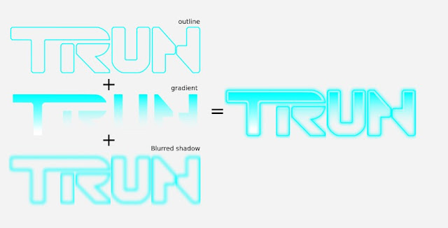
Now we can add the text to our image.
And the end result is what we expected. Did you like it?

** If you liked the article and learned something to help you, you can support me by sharing the news with your friends. See you in the next article.

If you want to know more about the video game these links may seem interesting.


Some photos

Asociación de amigos del MSX


https://www.msx.org/es/news/software/es/trun-nuevo-juego-de-msx


6/2/17

Portada para videojuego TRUN de VGsource


Hablar de TRON es hablar de un clásico de la ciencia ficción y de uno de los mejores tributos a la creatividad e imaginación en el mundo del cine. Película un tanto incomprendida al inicio, pero el tiempo le dio la razón y la puso en su lugar. Y si hablamos de elementos míticos de la película, tenemos que hablar de las carreras de motos de luz...

TRUN es un videojuego creado en ensamblador Z80 basado en TRON.
Los creadores del Juego son Vgsource, un grupo indie de desarrollo que programa para MSX.
Hace unos meses, me contactaron para diseñar su portada y así darle un impacto visual mayor.
Fue un trabajo interesante porque desde el primer momento se buscaba un "look" ochentero imitando el estilo de portadas de la época de Dinamic o Topo, donde Azpiri era el rey ilustrando esos bellos casettes y lo de menos era el resultado en pantalla ( al menos para personas como yo)
Lo primero que hice fue coger referencias, y como no iba a ser de otra forma la propia película de TRON fue la principal fuente de inspiración. Tenía varias claves en mente mientras pintaba esta ilustración:
  • Azul
  • Luz
  • No Fx overlay.
  • Velocidad
  • Espíritu 80's
¿Os apetece ver como fue el desarrollo? Pues analizamos las diferentes fases brevemente.

Fase de Bocetos

Después de analizar qué quiero destacar en la imagen empiezo a trabajar en los bocetos.
Estos son dibujos no muy detallados en los que se pueden ver los elementos principales del diseño.


Me decido por la primera por la sensación de movimiento.


Como ya sabemos las diagonales añaden movimiento a la composición y como quiero transmitir velocidad elijo el diseño con ese esquema y lo amplio para poder estudiar dónde colocar cada cosa. Algo que al final voy a cambiar son las motos. Finalmente serán aun más “homenaje” a las originales motos de luz diseñadas por Syd Mead.

Fase de referencias

Siendo el juego un calco del juego de TRON no me parece una locura coger referencias de la película. Ya que vamos a hacer una copia de un clásico vamos a hacerlo bien. ¡Que se note! Por eso creo una composición con las múltiples referencias para luego pintar por encima lo que necesite y llegar al resultado que quiero, no tan foto sino más 2d. Queda aun mucho trabajo.Este sistema no es el único que uso para mis ilustraciones.

Este es el resultado del collage realizado dentro de Krita. Todas las imágenes tienen sus derechos de autor correspondientes. Esto solo lo usamos como idea. Al final se repinta el 100% de la ilustración.


A partir de este punto vamos a trabajar los fondos. Para los fondos normalmente se usan pinceles que sean rápidos que "cubran" Utilizo un pincel que tiene la característica que difumina la pintura cuando se ejerce poca presión y va añadiendo más pintura según aumenta la presión. Es este que os muestro en la captura.


Tiene un efecto como de espátula y pertenece al set que hice para el DVD de la krita foundation #muses. Si os interesa os lo podéis descargar aquí totalmente gratis.

PACK bundle muses

Nota: Si por alguna razón veis que este pincel produce algo de "Lag", una cosa muy útil que acelera tanto este pincel como muchos de los de Krita es utilizar el parámetro "precisión" dentro del editor de pinceles y bajarlo de 5 a 1. Si además utilizas tamaños grandes puedes aumentar el espaciado del pincel hasta 0.5 o 0.7. Se puede optimizar aun más para ganar velocidad en tamaños muy grandes.


Más allá verás que va muy fluido pero pierde un poco de calidad. Estos pinceles exigen operaciones de cómputo importantes para la CPU pero dan resultados muyyy interesantes.  

Lo que quiero es desdibujar el efecto foto pero respetando los colores que hay debajo aun siendo manchas  y a la vez darme más libertad para pintar por encima. Veréis que el resultado es muy pictórico. Artesanal dentro de lo digital.


Ahora es tiempo de empezar a definir todos los elementos de la imagen.

La cara en la foto no muestra una emoción acorde a lo que busco, vamos hombre! ¡Que te estás jugando la vida en una carrera! :)

He creado este Gif para los que les gusta seguir una evolución de los pasos a seguir.

Se puede apreciar como va cambiando la iluminación según voy trabajando el metal. El gif lo hice con Gimp. Explica mucho más que una página de texto. Entre otras cosas se ve cómo la luz va afectandola cara del personaje y su casco.
Lo mismo sucede en el fondo. Cuando voy detallando las motos y la especie de hangar de donde salen.


Al ir completando la imagen corremos el riesgo de añadir demasiados detalles. Así que cuidado con el Glow y los modos aditivos o color dodge que enganchan.
Hacer lineas o curvas con precisión es complicado a mano alzada por eso una forma de evitarnos quebraderos de cabeza es utilizar los asistentes de pintura.


Por ejemplo un uso sería en la curva que define el panel de la moto del personaje.


Motos de Luz.

Un elemento principal de esta imagen son las motos de Luz. Vamos a hacer algo sencillo para no separarnos demasiado de lo que se verá en pantalla.


El problema según veo es que las motos necesitan unas lineas de movimiento. Esto va a transmitir más sensación de carrera. Al final opto por lineas no en toda la moto sino en parte. El resultado es algo más impactante.


Diseño de Logo para la portada

Ya solo nos queda realizar un logotipo para el diseño de la portada. Para esa tarea mejor utilizo un editor de imágenes como Gimp y un programa de diseño vectorial como Inkscape.

En Gimp selecciono la herramienta texto con la tipografía previamente descargada que es muy parecida a la de TRON.


Para variar un poco el diseño ajusto y completo el contorno de la palabra TRUN De esa forma ya tengo una buena base para editarlo en Inkscape y que se pueda adaptar a cualquier tamaño sin perdida de calidad.

Ahora ya podemos añadir el texto a nuestra imagen.
Y el resultado final es lo que esperábamos . ¿Os ha gustado?
**Si te ha gustado el artículo y has aprendido algo que te ayude, puedes apoyarme compartiendo la noticia con tus amigos. Nos vemos en el próximo artículo.
Si quieres saber más del video juego estos enlaces te pueden parecer interesantes.

Algunas fotos

Asociación de amigos del MSX


https://www.msx.org/es/news/software/es/trun-nuevo-juego-de-msx